Language ESP / ENG
Language ESP / ENG
Bloomself Illustration
Bloomself Logo

Context

Bloomself is an app designed to help users organize their day, stay active, and achieve their goals through its virtual assistants, the Blooms, which grow and grant rewards based on the users’ activity levels.

Goals

Develop a daily-use mobile application that encourages healthy habits such as walking and running, while also helping users organize their activities through reminders and notifications.

Problems

  • Organization often feels like an obligation.
  • There is a lack of consistency in habits.
  • Productivity apps tend to feel boring or unmotivating.
  • There is no emotional connection with personal progress.

Solutions

  • Design an app that motivates users to walk and move more.
  • Add an emotional and fun layer to productivity.
  • Allow users to improve while watching their virtual pet grow.
  • Make users feel rewarded for their efforts.

PROCESS

>

1 - EMPATHIZE

Quantitative research

We analyzed the use of three types of apps: sports, organizational tools, and virtual pet games, in order to identify opportunities in the development of Bloomself. The data shows a strong adoption of digital media and significant growth in sports and simulation apps among Generation Z users.

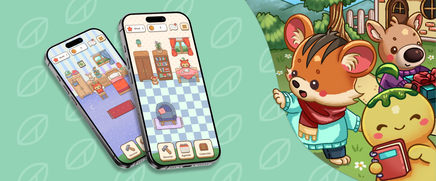
These users seek experiences that combine productivity, motivation, and entertainment, valuing gamification and reward systems. On the one hand, they indicate that virtual pets with dynamic personalities and social features help improve retention, while excessive reminders or repetitive tasks tend to lead to app abandonment.

User interviews

We conducted interviews with two young female users who showed interest in improving their habits, increasing physical activity, and becoming more organized.

The results we obtained show that they prefer simple digital tools, accessible from their mobile devices, and that they also value useful and positive reminders from their virtual pets, with which they want to build a stronger connection and sense of companionship. They also highlighted their interest in rewards, dynamic missions, and engaging experiences that make the process more enjoyable.

2 - DEFINE

Benchmarking

We conducted research on different apps similar to our project. The most comparable ones were Roubit (Roubit Inc.), Pikmin Bloom (Niantic Inc.), Animal Crossing (Nintendo), and Tamagotchi Forever (BANDAI NAMCO).

However, none of them shared all the features we wanted to implement in Bloomself, so we took inspiration from each of them.

User Persona

Marta is a fictional persona representing our potential users.

She works in the design field as a freelancer and finds it difficult to maintain a balance between her professional responsibilities and her health.

Customer Journey Map

We outlined a real-life scenario for Marta: she has to deliver a project in less than a week and is trying to get better organized, but she struggles to maintain consistency and a clear structure. Although she attempts to improve through small habits, she feels stuck due to the lack of a visual record of her progress.

From this analysis, several opportunities emerged, such as providing a daily activity summary and establishing predefined routines that make the app easier to use and strengthen task tracking for users.

3 - IDEATE

Information architecture map

The project has a particular structure, combining organizational elements and physical activity with gamification. The solution we found for how to present information within the app was to base it on the home where the virtual pets, the Blooms, would live.

In total, we created around seven content maps, plus one for the house itself, and each of them has different themes and functionalities associated with a specific room.

User flows

Bloomself aims to combine gamification with sport and personal organization in a clear and engaging way. With this in mind, we designed two user flows: one detailing the process of furnishing the Blooms’ home, and another showing how users can add an event or task to their agenda.

Decoration
Agenda

4 - PROTOTYPE

Design System

In the prototyping phase, we developed a coherent design system focused on conveying a friendly, motivating, and easy-to-use experience. We defined two color palettes: one for the UI and another for the in-game illustrations. Both combine warm, natural tones with vibrant accents that reinforce the app’s welcoming character.

For typography, we chose a sans-serif typeface that remains highly legible at small sizes to improve mobile accessibility. We also designed icons with rounded shapes to maintain visual consistency with the game elements.

Finally, buttons were designed with rounded corners and subtle shadows that mimic depth, encouraging users to interact with them. Patterns and grids helped us structure the screens and avoid visual monotony.

Final prototype

Final Prototype

5 - TEST

Usability tests

We conducted two tests with participants with different profiles; one of them did not fully match the target audience, as she was not part of Generation Z (she was over 45 years old) and did not usually use this type of app, while the other participant did fall within the target group and regularly uses similar products. We obtained the following results:

  • Product overview: Both participants expressed that they liked the visual section of the app, as well as the icon design. The interaction flows also made it easy for them to complete the test.
  • Profile page: The participant could not find the functions at the bottom of the screen, as there were no indications that the page could be scrolled downward.
  • House navigation: The option to move between rooms by swiping across screens was overlooked in favor of using the map.
  • Decorate function: They experienced some difficulty placing the furniture during the test, as the mechanic was designed to position items by tapping, while they instinctively tried to drag and drop them instead.

Implemented improvements

Based on the insights gathered, we were able to improve the profile screen by reducing the size of the avatar, making it clearer that there is additional content available within this section.

Implemented Improvements